Some time ago there was some chatter on twitter about why the save icon in lots of programs was still a floppy disk, given that one has actually used floppies for around 10 years now:
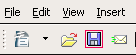
part of the answer is of course lack of agreement on what to replace it with. Libre Office uses something that's supposed to be a file being saved to a hard disk
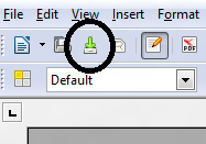 but that really doesn't work. It's odd, does it mean download, is there a different icon for a network save etc etc (and if you're like me and need glasses, it can look like a printer icon on a small screen).
I guess we're kind of stuck with the floppy as the universal save icon until someone comes up with something with universal appeal. I find it slightly amusing that some android text editors (text edit for example) still use the floppy disk icon to mean save.
The other thing would be to be to simply change the default action - when you close a document you are asked to save it. That's ok, except that I quite often want to save a copy of the file I'm working on to dropbox so I can review it at home, and then come back to the version on my machine at work the next day. So I'd need a special push to dropbox icon.
Rather than agonise I think we need to be more like road signs and simply live with them as conventions. In the UK and much of Europe the sign for an ungated level crossing looks like this:


it's a graphic representation of a crossing marker with flashing lights, and not something universally recognizable. It may, like the Libre Office save icon make intellectual sense but it isn't immediately recognisable as it's not part of our graphic lexicon ...
part of the answer is of course lack of agreement on what to replace it with. Libre Office uses something that's supposed to be a file being saved to a hard disk
I guess we're kind of stuck with the floppy as the universal save icon until someone comes up with something with universal appeal. I find it slightly amusing that some android text editors (text edit for example) still use the floppy disk icon to mean save.
The other thing would be to be to simply change the default action - when you close a document you are asked to save it. That's ok, except that I quite often want to save a copy of the file I'm working on to dropbox so I can review it at home, and then come back to the version on my machine at work the next day. So I'd need a special push to dropbox icon.
Rather than agonise I think we need to be more like road signs and simply live with them as conventions. In the UK and much of Europe the sign for an ungated level crossing looks like this:
which works, even though steam trains are thin on the ground these days purely because almost everyone knows what a steam train looks like even if they've only seen them on TV in period dramas.
In contrast the usual Australian sign is truly bizarre
No comments:
Post a Comment